Graphs of the input data can better help your understanding of the consolidation process.
To produce these graphs, choose Tools | Input data plots (from the consolidation menu) or when specifying the input data files, click the [Plots] button.
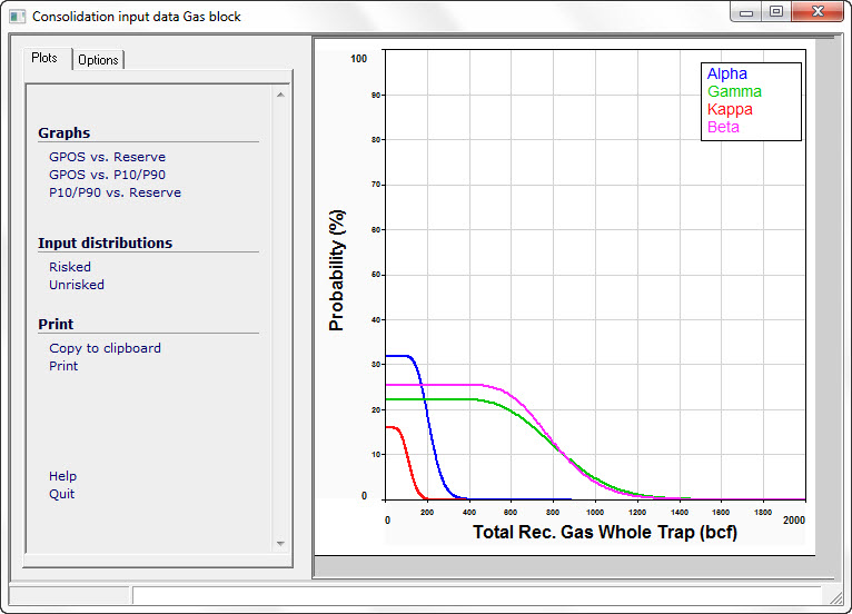
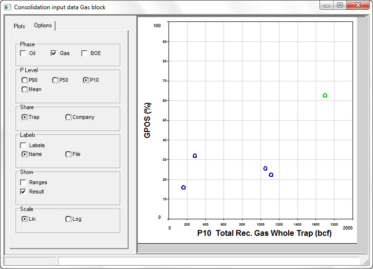
There are two styles: graphs (cross-plots) and input distributions. Cross-plots are risk (GPOS) vs. reserve, risk vs. uncertainty (P10/P90 ratio) and uncertainty vs. reserve. The input distributions can be either risked or unrisked but note that the unrisked graph can be more trouble than it is worth. Examples are shown here:

The Options tab allows you to control what is plotted and how.
To recognize which point is which input file, click on the point or distribution. The name or filename of the data point is shown in the status bar at the bottom of the window. You can also label the points on the cross-plots.
Click Result in the Show box to show the consolidation result on the plot. This can be a good or bad thing to do, depending on the level of understanding of your intended audience.
On cross-plots, prospects are shown in blue, consolidations in red and the consolidation result is shown in green.
The phase (oil, gas, etc.) mirrors that which you are showing on the main consolidation summary screen. Change the phase (or the units) on that screen and this one is updated.

Phase |
|
Oil etc |
Click the phase you want to show. If it flicks back to the one it started with, it will be because that phase is not present. |
P Level |
|
P90, P50, P10, Mean |
Choose for which probability level to show the volume |
Share |
|
Trap, Company |
Choose to show whole trap or company share volumes |
Labels |
|
Labels |
Check to show labels on the plot |
Name/File |
.. and whether to show the prospect name or the file name |
Show |
|
Ranges |
This shows the input data range as a bar P90 - P10 |
Result |
Also shows the result (in green). |
Scale |
|
Lin/Log |
The x-axis (volume) can be either linear or logarithmic |